The need for Srcerer
Srcerer has been designed to meet some particular needs, and to overcome particular challenges, that designing for the modern web requires - catering for the range of device sizes, the different resolutions, different focal points and much more.
Srcerer features
Screrer contains 4 distinct stacks that each cater for a different need. Each is also packed full of powerful options.
Hugely flexible image delivery
Supply an appropriate image (width and content) to every device
Search Engine Optimisation
Delivering the right sized image is fast which is key for SEO
Extensive display options
Show just the image in all its glory or add content / create a card. You can even add hover, blending and parallax effects!
Modern lightweight coding
Using only the latest approaches to HTML and CSS code to achieve to deliver responsive images
All images on this page have been added using Srcerer. (The only exception is the logo / icons. There would be no real advantage in using Srcerer for small fixed width images such as these)
The Srcerer stacks
1. Sizes stack
This stack (the original Srcerer stack) allows you to add up to 8 different width versions of the same image. The code that Srcerer creates gives the browser enough information for it to be able to serve the most appropriately sized image for whatever device is being used. You can even supply information about how your images are used for even more efficient results!
Summary: Use Srcerer Sizes stack to improve the speed and efficiency of image delivery and ensure a great quality image is displayed on every device.

2. Art Direction stack
This stack allows you to use different versions / compositions of the same image at different breakpoints. This means that you can make sure that the important part of any image is clear and central on any device. (Note: You can of course use different images for each breakpoint however be aware that all included images will share the same Alt tag). You can add up to 4 different versions of an image.
Summary: Use the Art Direction stack to ensure that the key message / focus area in your images is clear on every device.

3. WebP / AVIF stack
This stack allows you to make use of the WebP image format. This format is well worth checking out if you don't already know about it as the file sizes are tiny with no loss of quality. The stack also allows for a fallback image that would be used in browsers that cannot yet use WebP images (most now can though!).
Summary: Useful the WebP / AVIF stack to make use of the latest image file formats whilst also catering for browsers that cannot yet display these image types.

4. Single stack
This stack is not concerned about responsive image delivery. It is simply a way for you to use a single image and access all of the great effects and options that Srcerer stack offers. It is perfect for images that are a fixed width on all devices and therefore would not benefit much from enabling alternative versions.
Summary: Useful for a quick and easy image stack and for where there is no need to supply different versions / sizes of the image.
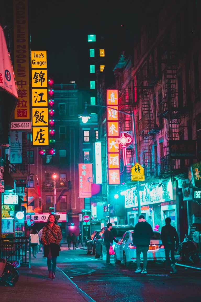
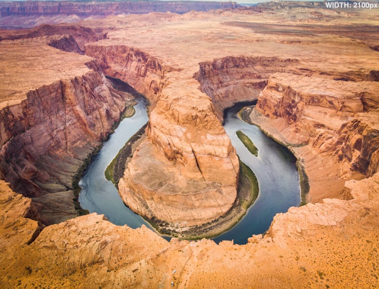
Example 1 - Srcerer Sizes
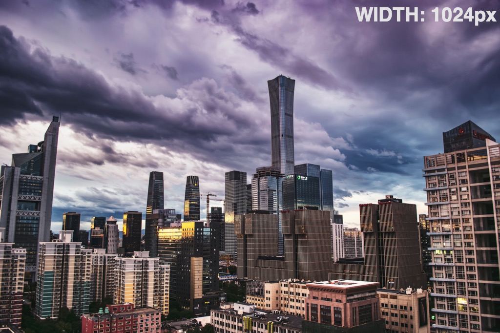
Consider the image above
This is set to show at the full site (content) width, which, on this particular page, will be a maximum width of 1120px on desktop. On all devices with a screen size less than this width, the image will take up 100% of the available space. On a non-retina mobile phone (in portrait mode) this could be as small as 320px. Perhaps surprisingly, on (for example) a 10.5" iPad Pro, the required image size will actually be greater than 1120px as it has a resolution that equates to 2224x1668px (in landscape mode that is almost twice the width of the image required for desktop!).
So what size of image do we provide in our RW project?
Do we cater for the maximum possible size on desktop (in this case 1120px) or do we go somewhere between that and a mobile device width (maybe 800px) that might still look acceptable on a desktop when displayed at 1120px? Or do we provide an image good enough to take full advantage of the screen on an iPad Pro?
If we go for the desktop size of 1120px then we can guarantee that the image will look good on all devices. (It won't look as good as it could on an iPad Pro but would still look ok). But providing an image of this size would come at a cost when viewed on a mobile device. Check out the table to see the differences in file size that this image has at various different widths.

| Width (px) | File size (kb) |
|---|---|
| 320 | 28 |
| 640 | 90 |
| 768 | 126 |
| 1024 | 208 |
| 1120 | 247 |
| 1366 | 344 |
| 1600 | 464 |
| 1920 | 653 |
You'll see that for this single image alone, if the 1120px image is loaded on a 320px (non-retina) mobile phone it will use over 200KB more than the 320px version would have required. That's a very considerable difference and obviously If you scale this up for multiple images on a page then you can see that quite quickly the unnecessary data usage would soon add up and speed on poor connections would be significantly slowed down.
So what is the alternative?
Glad you asked. Step up Srcerer (Sizes) stack. With Screrer you can supply up to 8 different versions (at different widths) of the same image. And then it's over to the browser to work its magic. Browsers these days (with the obvious exception of IE11) can use the information provided by Srcerer stack to intelligently select which image is best to use for whatever screen size it is being viewed on.
Example 2 - Art Direction

Consider the image above
This looks fine on a large screen and the family within the image can be clearly seen. On a mobile device however, this same image would be too small to be able to properly see the people. Obviously if the subject / focal point of the image is important then this is an issue.
How can art direction help?
Srcerer (Art Direction stack) allows you to add up to 4 different versions of an image that will be switched out at 3 different breakpoints. You can therefore frame / size / crop the original image however you like for each breakpoint to ensure that the focal points of the image are not lost on any device. For the image above we might opt to create a cropped version of the image that we would show on mobile devices like so:
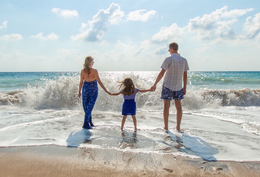
Can object-fit: cover not do this?
There are ways that you can use CSS (such as object-fit: cover) to size and crop your image however there is very little control over this and therefore is extremely difficult to get the framing right on each device. With Srcerer those framing and 'art direction' decisions are yours, as a designer, to make and then implement.
What else is the Art Direction approach good for?
This is great for creating bespoke banner images that will display exactly as you need them to on all devices. You can, for example, create up to 4 distinct versions of a banner image and select on what screen size each should be shown at. No longer are you left to guess how your artwork / images will display across devices.
What about different widths/resolutions of devices?
As well as being able to link up to 4 different versions of an image, Srcerer Art Direction stack also gives you the option of linking 2x and 3x versions of the images too. If these have been included then (like with the Sizes stack) the browser will select the most appropriate version for any device.
Added extras
Each of the Srcerer stacks have all of these display options to make your images really stand out:
- Create Banner / Hero images using 'Cover' mode (like at the top of the page!)
- Add content on top of your image (in one of 6 preset positions)
- Add content beneath the image (i.e. a caption)
- Use any stack(s) as content
- Make image a link
- Create beautiful looking 'cards'
- Add hover effects
- Add a parallax effect
- Use blending modes
You can see examples of many of these below. In short, Srcerer is an image stack that is a must in any RapidWeaver toolbox!
Adding content
You can opt to add content below the image (as a caption) or in one of 6 preset locations on top of the image (top-left, top-right; top full, centre, bottom-left, bottom-right and bottom full).
You can add any content / stacks that you wish (though you what you add will need to fit within the image on all device sizes as any overflow will be cropped).
Creating cards
You can create a 'card' effect with any image (and added content). There are 7 preset effects included along with a 'custom' option. (The last example also has had a parallax effect enabled!)
Some

example
cards
Adding hover effects
There are several preset options for adding a hover effect to your images: Blur, Zoom In, Zoom Out and Opacity. You can also opt to only show any added content on hover too.

This is an example of the Blur hover effect (and of showing added content on hover!)
Hover to see the image Zoom Out
Hover to see the image Zoom In

Hover to change opacity / see background colour
Adding Blends
You can opt to blend the image with its background and also opt to blend any added content with the image. You can create some really nice effects by playing about with the options provided here.
Content blend
Image Blend
Combined Blend
Adding parallax effects
You can also opt to add a parallax effect to any image. This uses some aspects from our popular Parallaxer stack and allows you to specify the direction of effect that you wish to apply.
Direction: UP
Direction: DOWN
Direction: LEFT
Direction: RIGHT
Combining effects
And of course you can combine any / all of these effects with any image (with the exception of combining Hover and Parallax effects)! Here are a few examples of combining adding links, content and hover effects:
Tap / Click for more information


Tap / Click for more information
Get Srcerer
You can get this stack on its own or as part of our hugely discounted stacks bundle.
Our stacks bundle includes Srcerer and ALL of our other stacks that are currently available. Buying as a bundle offers huge savings compared to buying the stacks separately. Currently the bundle consists of the following stacks:
Popular
Srcerer
Add responsive and beautiful images to your web sites
Sunset sale. Get 40% off in our closing down sale
Automatically applied during checkout
Buy for
Buy for
Buy for
Over 60% off!
Stacks bundle
Our stacks bundle includes ALL of our stacks in one incredible bundle dea (along with an exclusive project file)!
Sunset sale. Get 40% off in our closing down sale
Automatically applied during checkout
Buy for
Buy for
Buy for
FAQs
Below are some of the most common questions about this and our other stacks.
Stack FAQs
There are no specific FAQs for this stack at this time. See our general FAQs below. If you have a particular question about this stack then please get in touch.
General FAQs
Yes this stack has been designed to work in any framework. If you encounter any issues then please contact us with an example and we will do our best to resolve.
All our stacks use only local resources, collect no data and include no calls to remote servers or CDNs etc. As such the stacks are completely GDPR compliant.
We have a full supporting Knowledge Base including articles for all of our stacks and settings. If you can’t find what you need there then do not hesitate to reach out to us via your preferred channel.
The whole site has been built with Source micro framework. In addition, this page also uses (obviously). Finally, this FAQ section has been built with Toggle stack and the Bundle details section above uses Moreish stack.
