Make your content pop!
Popper stack is perfect for drawing the viewer's attention to particular areas or just used to break up solid blocks of content. It can be used in one of 2 modes: Framer and Divider.
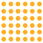
Examples
Pattern builder
Popper offers three basic pattern elements: Dots, Blocks, Checks and Lines. You can add any of these (and any combination of these) to either 'frame' some of your page content or to divide your content.
The 4 default Popper patterns are:
You can fully control the size of the pattern, the size of the pattern shapes and the colours used. All of the examples in this section are 300px x 20px in size but the patterns can be any size at all (using either px or %).
Get creative
These options (along with the ability to 'layer' your pattern elements) means that there is a lot of scope to get creative! Here are a few examples but the possibilites are endless.
Framer mode
In 'Framer' mode, Popper stack allows you to add a pattern (either dots or squares) around any other stack. These patterns frame the content and allows you to draw attention to areas of importance. It can of course just be used to break up the monotony of flat content and to bring areas of enhanced visual interest to your pages.
You can add as many different patterns to a single stack and for each you can choose for it to appear in any of the following positions (in relation to the added stack content):
- Top-Left
- Top-Right
- Bottom-Right
- Bottom-Left
- Centre
Make your images pop!
Popper works especially well with images and allows you to bring flashes of colour with your patterned elements to break up solid blocks / rectangles.

Colour, style and positioning
Select colours that compliment your content and position your patterned elements wherever suits best.
Layering options
You can opt to add each pattern element under the added stack (default) or place it over the content.
You can create some really interesting effects by mixing up your approaches.


Create lines
By adjusting the width (or height) of Popper Blocks, you can create horizontal (or vertical) lines. These are much more flexible than adding borders, allowing you to control the length, width, quantity and also create overlaps etc.
Make your anything pop!
Popper is probably best suited to use with images however it is great for any piece of content (any stack / group of stacks) that you want to draw particular attention to. Text boxes and quotes are good examples.
Note: The quote example here uses nested Popper stacks, one to frame the quote and then another to frame the frame (i.e. with the dots on the top and bottom).
Text boxes
Bring your text boxes to life by adding patterned elements in ways that catch the eye without being distracting.
The options for pattern creation and placement are literally endless!
Create bold text boxes that will catch the eye of your web page visitors.
Allow the Popper pattern to be seen behind the content to give some really interesting effects!
Blobs
Blobs are all the rage in web design. Adding them behind your content (or even making a full foreground feature of them) can really bring some well needed soft lines to otherwise stark web pages. They also inject a huge amount of colour and life into your content.
Popper - Blobs
The Popper Blobs sub-stack could really be a stack in its own right but, as the blobs are really to make your content 'pop', we just decided to add it into the existing Popper stack.
Popper Blobs ships with 20 blob shapes and 8 regular shapes. You can even add your own custom paths if you are handy with creating svgs! All of this means that the options for what you can create with this stack are endless. Have a look at some of the cool things that you can do with Popper Blobs on it's very own Blobs Demo Site!
Divider mode
Popper stack can also be used to design and create dividers that you can use throughout your page to divide sections of content.
Dividers are great as a visual indicator of where a change in content occurs and can help visitors to your page better understand how your content is structured.
Squiggler mode
Anoother option is to add a 'squiggly' line underneath text. It can be used to draw attention to key bits of information.
v1.2 of Popper stack ships with a brand new companion stack: Squiggler. With this stack you can:
- create squiggle dividers
- target particular elements contained in the stack (or on the whole page) including:
- links like this (<- hover over me!)
- spans
<span> - horizontal rules
<hr> - bold text
<strong> - italic text
<em>
In addition, you can set the squiggle to show at all times (default) or only on hover.
Squiggler also provides you with numerous styling options such as direction of squiggle, colour of squiggle, height of squiggle and speed of squiggle.
Squiggler is a great way to draw attention to particular content on your web pages.
Get Popper
You can get this stack on its own or as part of our hugely discounted stacks bundle.
Our stacks bundle includes Popper and ALL of our other stacks that are currently available. Buying as a bundle offers huge savings compared to buying the stacks separately. Currently the bundle consists of the following stacks:
Popper
Add patterns to beautifully frame and divide your content
Sunset sale. Get 40% off in our closing down sale
Automatically applied during checkout
Buy for
Buy for
Buy for
Over 60% off!
Stacks bundle
Our stacks bundle includes ALL of our stacks in one incredible bundle dea (along with an exclusive project file)!
Sunset sale. Get 40% off in our closing down sale
Automatically applied during checkout
Buy for
Buy for
Buy for
FAQs
Below are some of the most common questions about this and our other stacks.
Stack FAQs
There are no specific FAQs for this stack at this time. See our general FAQs below. If you have a particular question about this stack then please get in touch.
General FAQs
Yes this stack has been designed to work in any framework. If you encounter any issues then please contact us with an example and we will do our best to resolve.
All our stacks use only local resources, collect no data and include no calls to remote servers or CDNs etc. As such the stacks are completely GDPR compliant.
We have a full supporting Knowledge Base including articles for all of our stacks and settings. If you can’t find what you need there then do not hesitate to reach out to us via your preferred channel.
The whole site has been built with Source micro framework. In addition, this page also uses (obviously). Finally, this FAQ section has been built with Toggle stack and the Bundle details section above uses Moreish stack.
